



A few years ago, accessibility was the item that got pushed to “phase two” on most product roadmaps. Something to revisit after launch, once the real features were done. That window has pretty much closed. Accessibility complaints now turn into legal letters, procurement teams ask for conformance reports before signing contracts, and a growing share of customers simply leave when a site fights them.
The good news is that building an accessible, legally defensible interface isn’t mysterious. It mostly comes down to a handful of habits applied early and consistently. This guide covers what those habits are, where UI UX design teams usually slip, and how to tell whether your product is actually in good shape or just looks like it is.
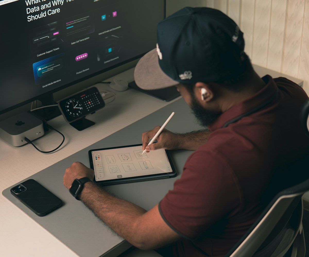
Accessibility decisions are cheapest at the wireframe stage and most expensive after launch, when every fix touches live code.
Start With the Standard Everyone Points To
Accessibility laws differ from market to market, but almost all of them lean on the same technical benchmark: the Web Content Accessibility Guidelines, usually shortened to WCAG. Whether a regulation, a public tender, or an enterprise buyer is asking, the practical question is nearly always “does this meet WCAG 2.1 or 2.2 at level AA?”
That makes WCAG the most useful single target for a team. It’s organized around four principles, often remembered as POUR: content must be perceivable, operable, understandable, and robust. Each principle breaks down into specific, testable criteria. It’s a lot of criteria, but most real-world failures cluster around a small number of them, which is where we’ll spend the next few sections.
Color and Contrast: The Most Common Failure
Low contrast text is the issue auditors find most often, mostly because brand palettes get chosen for looks rather than legibility. Light grey text on white feels elegant in a mockup and becomes unreadable for anyone with reduced vision, or anyone using a phone outdoors.
At level AA, normal body text needs a contrast ratio of at least 4.5 to 1 against its background, and large text needs 3 to 1. Interface components like input borders and icons need 3 to 1 as well. Check these during UI UX design, not after: swapping a color token in a design system is a five-minute change, while hunting down hardcoded hex values across a finished product is not.
One more rule that gets missed: never use color as the only signal. An error state shown only by a red border excludes people who can’t distinguish red from other colors. Add an icon and a plain-language message and the problem disappears.
Keyboard Access Is Not Optional
Many people never touch a mouse. Some use keyboards because of motor impairments, others rely on switch devices or voice control that ultimately behave like a keyboard. Every interactive element, from menus to date pickers to modal dialogs, has to be reachable and usable with keys alone.
A quick test anyone on the team can run: put the mouse aside and try to complete your main user flow using only Tab, Shift+Tab, Enter, Space, and the arrow keys. If you get trapped inside a widget, lose track of where focus is, or can’t reach a button at all, you’ve found a real defect. Visible focus indicators matter here too. Removing the focus outline because it “looks messy” is one of the most damaging small design choices a team can make.
Structure and Semantics for Screen Readers
People using screen readers navigate by structure, not by looking. They jump between headings, landmarks, links, and form fields. When a page is built from generic containers styled to look like headings and buttons, that structure doesn’t exist for them.
Use real heading levels in a logical order, real button and link elements, and proper labels tied to every form field. Reach for ARIA attributes only when native HTML genuinely can’t do the job; a surprising amount of inaccessible UI comes from ARIA added incorrectly, which is often worse than none at all. Images that carry meaning need useful alternative text, while purely decorative ones should be marked so assistive tools skip them.
Forms, Errors, and Timeouts
Forms are where accessibility problems turn into lost revenue, because a person who can’t finish a checkout simply doesn’t buy. A few details make a big difference: visible labels rather than placeholder-only fields, clear descriptions of required formats, error messages that explain what went wrong and how to fix it, and error text that’s announced to assistive technology when it appears.
Time limits deserve attention as well. Sessions that expire quickly can lock out people who need longer to read or type. Warn users before a timeout and let them extend it.
Motion, Media, and Content Choices
Auto-playing video, parallax scrolling, and animated carousels can trigger vestibular symptoms or simply make content impossible to read. Respect the operating system’s reduced-motion preference, give people controls to pause moving content, and never flash anything more than a few times per second. Video needs captions and, where relevant, audio descriptions; audio needs transcripts. Plain language helps everyone, and it’s especially valuable for people with cognitive disabilities or those reading in a second language.

Compliance works best as a shared review habit across design, engineering, and legal rather than a last-minute audit.
Making It Legally Defensible, Not Just Technically Compliant
Meeting the technical criteria is half of the job. The other half is being able to show that you did, and that you take it seriously. A defensible position usually includes:
- A documented standard. Decide on WCAG 2.2 AA as your target and write it into your design system and definition of done.
- An accessibility statement. A public page describing your commitment, known limitations, and a real way to report barriers, monitored by a real person.
- A conformance report. For business customers and public-sector buyers, a formal document that records how the product performs against each criterion.
- Records of remediation. Logging issues found, who owns them, and when they were fixed shows good faith if a complaint ever arrives.
- Legal review of local requirements. Rules vary by region and sector, so have counsel confirm what applies to your particular product and audience. This article isn’t legal advice, and no design team should treat it as such.
How to Actually Test It
Automated scanners are useful, but they catch only a fraction of real problems, since they can’t judge whether alt text is meaningful or whether a flow makes sense. A solid testing mix covers four layers: automated checks in the build pipeline to catch the obvious regressions, manual keyboard and zoom testing by the team, screen reader passes using the common tools on desktop and mobile, and testing with disabled users themselves. That last layer is the one that reveals what the others can’t, and it’s the one most teams skip.
Run it as an ongoing practice, too. Every new feature, redesign, or third-party widget can introduce fresh barriers, so accessibility checks belong in each release rather than a once-a-year audit.
Where the Design Process Usually Goes Wrong
Looking across projects, the same patterns repeat. Teams treat accessibility as a QA phase instead of a design input. Components get built once without accessible behavior and then copied everywhere. Third-party plugins, chat widgets, and cookie banners get bolted on without anyone checking them. And nobody owns the outcome, so everybody assumes someone else is handling it.
The fix is mostly organizational. Put accessibility requirements in design briefs, bake them into your component library so every new screen inherits them, and name a person accountable for conformance.
Why Choose Web Squalix
Getting accessibility right is far easier when it’s part of the UI UX design process from the first sketch, not a cleanup job after launch. Web Squalix approaches UI UX design services with that principle: contrast, keyboard behavior, semantic structure, and readable content are decided at the wireframe and design-system stage, so accessible patterns are inherited by every screen that follows.
The team works across design and engineering together, which matters because accessibility lives in the handoff between the two. A beautiful interface that loses its focus order or labels during implementation isn’t accessible, and a shared process is what keeps that from happening. Components are built once, tested properly, and reused, instead of being re-solved screen by screen.
Support continues after launch, too. Audits, remediation of findings, and re-testing as new features ship are part of the engagement, because an interface that was compliant at release can drift out of compliance within a few sprints.
An accessible product is simply a better product: easier to use, easier to defend, and open to the widest possible audience. The best time to build it in was at the start. The second best is whatever sprint you’re in right now.