A logo is the face of your business, and first impressions are more significant than you think. Certain logos build instant reader trust and confidence; others prompt a click-and-forget. If your logo is cheap, your business is cheap, and that’s not something any business owner can afford.
The reality is that a cheap logo can really damage your business. It makes people feel that they don’t trust you. It gives your brand a disorganized appearance. In this world of high speed, individuals will form a thought about your enterprise in just a few seconds, and your poorly-designed logo may lead them to shake their head before you even come out and speak with them.
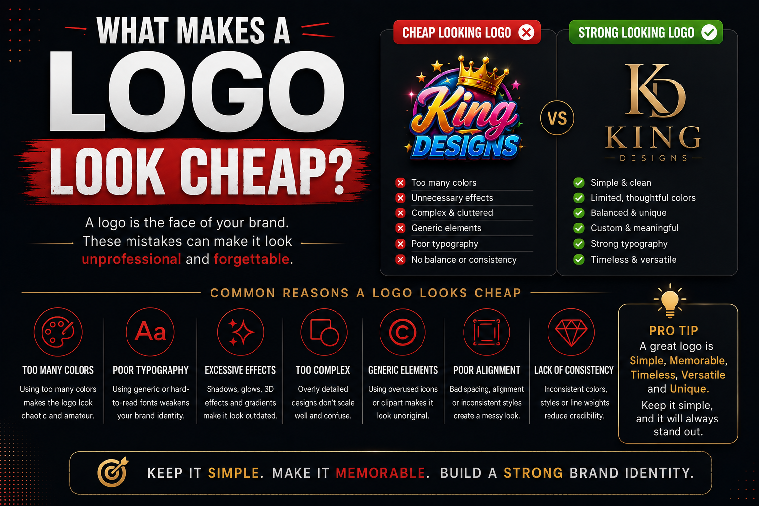
Well, what is the appearance of a cheap logo? Let’s keep it simple and discuss the following:
1. Too Many Colors
An error many people make is creating logos with too many colours. They believe there are more colours and more creativity. However, it is the contrary.
Most great logos will have only 2 or 3 colours, if any. Consider some of the world’s better-known logos. They’re not that complicated; they’re simple, and a limited number of colors are used. This simplicity is what makes them appear professional and strong.
2. Bad Font Choices
Most people do not realise how important fonts are. The font you use will reflect your brand. The wrong font will make your logo look out of budget.
The following are some of the widely observed incorrect usage of fonts:
- Too small a font size
- There can be a few issues if several fonts are used in the same document.
- No consistency in fonts throughout the paper for readability.
- Improper use of fonts (e.g., Comic Sans, Papyrus)
Expanding or compressing a text font to fit a space
3. Clip Art and Stock Images
If you use a clip art image or a stock icon as your logo that anyone can download for free, it will look cheap. Thousands of other businesses have used these types of images. They’re extremely conspicuous, and when people see them, they say the brand did nothing.
If your logo requires original artwork created for that particular brand, you’re on the right track. It is unique; it is custom. It’s not for anybody else. Affordable logo design services can help you get a superior, original logo design at an in-budget price. While beauty and design do not have to be expensive, they should be well thought out and well designed.
4. Bad use of space
The space within a logo, between its elements, and around it is just as crucial as the logo itself. Any overly busy logo looks disorganised and jumbled.
There are lots of logos that attempt to squeeze a lot of details into a small area, and they’re extremely cheap. All words, icons, shapes, and colours are squeezed together. Good logo design is the intentional use of space. Space is provided between elements. Everything is in its proper place. There is a good balance and visual appeal to the design overall.
5. Spotty design, or not understanding the pictures well enough
If the logo is so bad it appears fuzzy or grainy, it is a huge turnoff. This is typically caused by low-resolution logos or incorrect file type.
Professional logos are made in vector format. It will enable them to be any size while still being of high quality. Whether a logo is used on a business card or displayed on a giant sign, a vector logo will always be crisp and clear.
6. Copying Other Brands
Some companies create logos that are remarkably similar to those of well-known brands. They believe it will make them appear larger or more believable. It does not. It makes them appear to have no original ideas.
Copying another brand’s logo also poses legal issues. Businesses take their trademarks seriously. If it’s too similar, it could get you into serious trouble!
7. Faddish Designs Which Will Not Work Out.
Some logos are very much in tune with the latest design craze. They are very nice for six months, and then they’re quite outdated. A good logo will last. Not trend chasing. It’s simplicity and clarity that will be as relevant 10 years from now as it is now.
This is one of the greatest perks of having professionals working with you. If you’re at a loss for what to do you hire a professional logo designer he gives you clear concept or message.
8. No Clear Concept or Message
If the logo design is cheap, there is no clear concept behind it. It’s just random shapes and text glued together without any care and thought.
All great logos have a concept. All colours, shapes, and font selections are more than casual. The design conveys a message about the brand, which, if you can’t put it into words, you can sense.
9. Not using the default design tools competently
Everyone can now create a logo in minutes thanks to the easy-to-use free logo makers and simple design applications. Easy is not necessarily good.
These tools are reused for multiple uses. They are not very customisable. In most cases, their logos are very generic and forgettable.
Final Thoughts
Having a cheap-looking logo isn’t just a problem of aesthetics. It’s a business dilemma. It impacts your brand image, their trust, and whether they’ll pick you over your competitor.
The fortunate thing is that all these errors on this list can be prevented. And you don’t necessarily need to spend a lot of money to get a good logo. All you have to do is find the right way, with clear thinking, original design, and understanding of what a logo truly should do. Your logo is the face of your business. Ensure it conveys the correct message.


Leave a comment